YAKULT
Overview
The team at Yakult regularly host medical, science & health students at their Melbourne headquarters. They wanted to give visitors a fact sheet/brochure & promotional items to enrich their visit & provide reference for a later date.
The brief was simply: contemporary, content-focus, fun.
Visual Identity
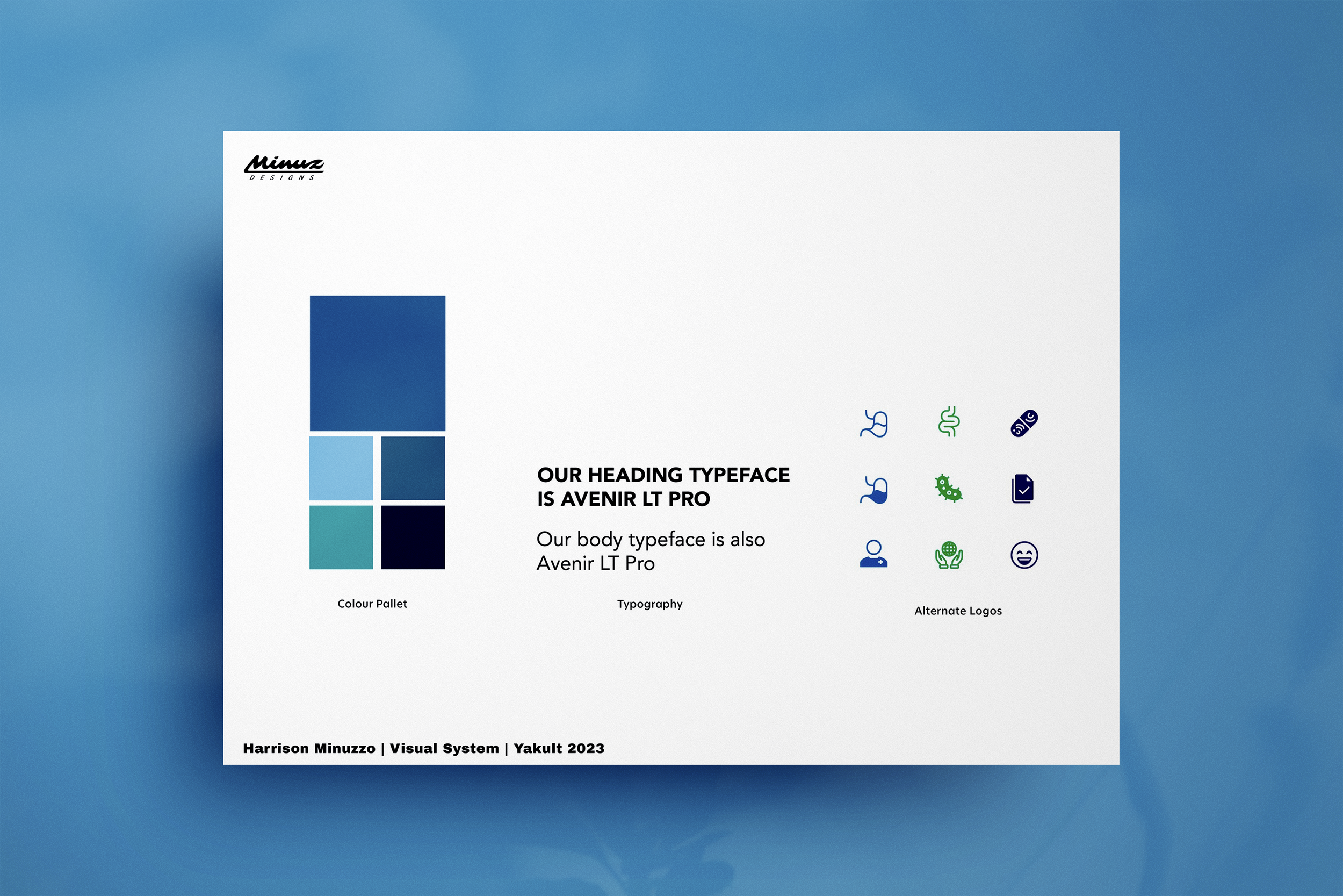
With limited brand guidelines, the challenge was to leverage the secondary colour (blue from light range) & the distinctive product bottle shape. I chose the elegant & iconic Avenir Pro that works well in large content slabs, allowing differentiation between the font sizes of headings & callouts, to provide a clear coms hierarchy. I explored the colour palate in hues of blue, introducing complimentary green for a playful & fresh contrast.
Iconography
I found inspiration for iconography from Yakult’s iconic bottle design, originally created based on the traditional Japanese Kokeshi doll in 1935. Using similar simple, rounded lines, I created a series of icons that succinctly capture the elements of bacteria & the stomach. The stomach is depicted as a simple outline representing its anatomical shape. In contrast, the bacteria icon showcases a group of microscopic organisms symbolized by small, curved shapes interconnected to convey their presence. Iconography & key graphic imagery features throughout the brochure design, adding both a playful element & graphic interest.