
Lunar Co.
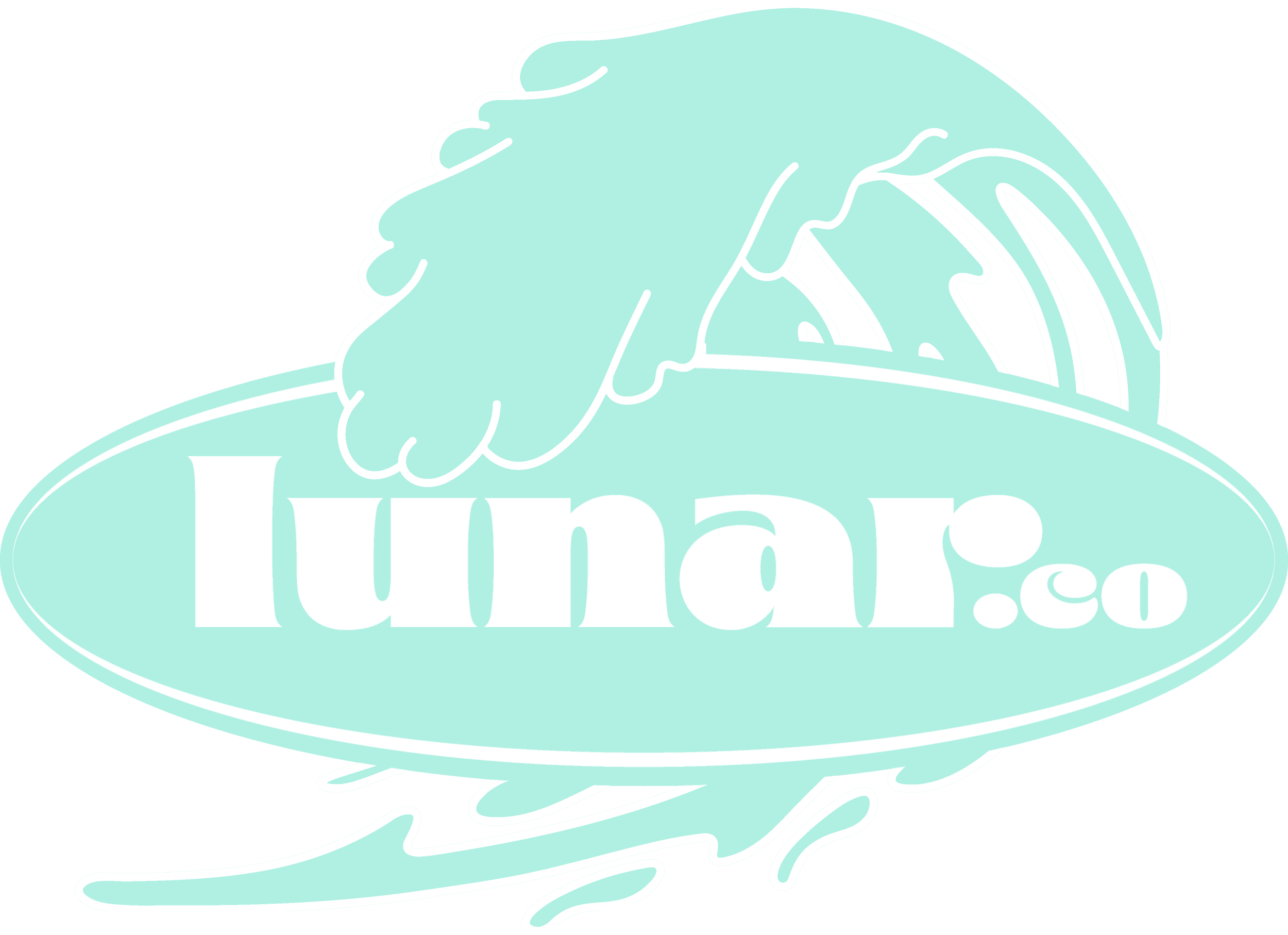
Lunar Co. Australia is an independently owned & operated, online Surf Inspired Streetwear brand. The name associated with the moon & inspired by its relationship with the tides, was required to exist as a logo. It had to be cool enough to live across a range of apparel & accessories as well support a visual identity system for their digital presence.
The brief: summer, surf, fun, iconic
Overview

Design
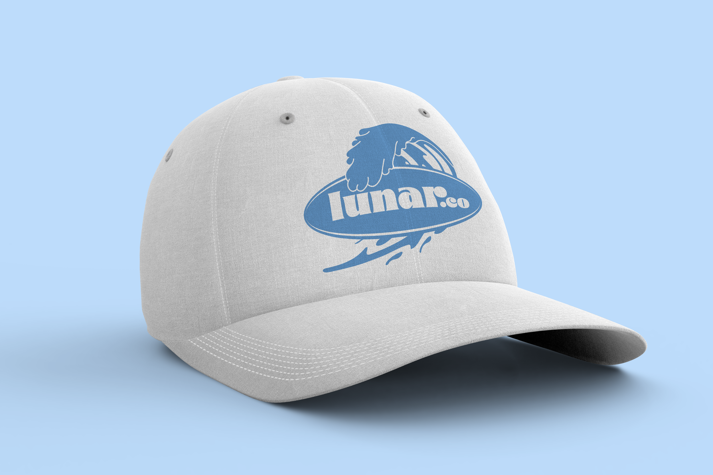
Inspired by its name, the three design elements I ultimately chose to explore were: wave, surfboard & typography. I chose a typeface that echoed the iconic 60’s beach culture, with a hint of the spirit of the psychedelic rock era, to add an element of cool. The wave was created from an abstract line drawing in a simplified etched style. The symmetry of the 3 elements creates a harmony, enhanced by a fresh, contemporary summer colour palate. The logo was required to be applied across various clothing items & accessories, doubling as a fashion element. The colour palate informed some apparel design.
Above | Illustration exploration
Above | Alternate logo colour ways


Digital
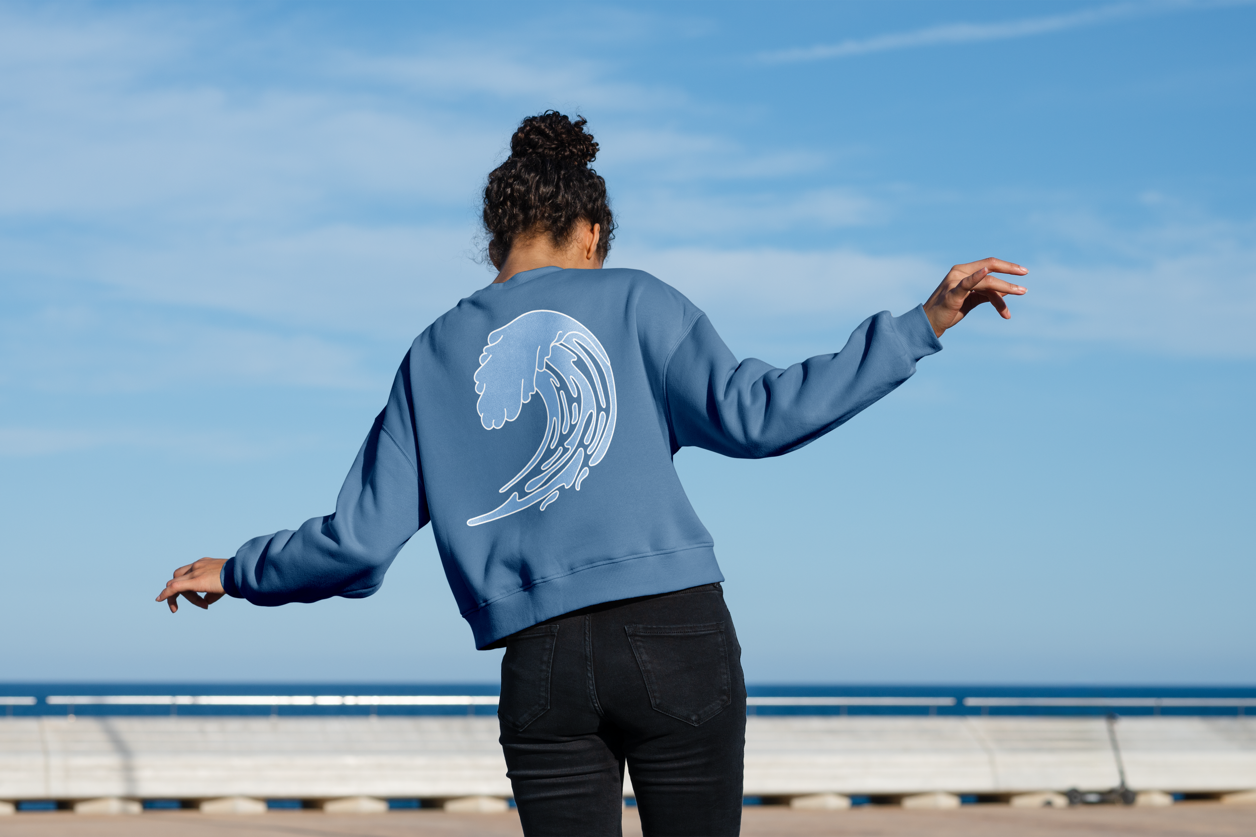
A key part of building the lunar.co brand was injecting the core lifestyle elements into its digital expression’s cross socials & web. Ultimately, both channels aim to drive retail sales ensuring visual templates for core item promotion, sale, sponsored events & inspiring lifestyle imagery that resonates with followers/customers.
As part of the brand visual identity, the photography style aims to capture insitu, real moments featuring discreet product placement. There is a sense of humour to the expression of the shots, not taking itself too seriously.
