
Fencing To The Max
Overview
Fencing to the Max is a Melbourne fencing business that specialises in new residential fencing. Starting out, the owner Max wanted a brand identity including a logo to apply to his business stationary & digital presence.
The brief: strong, iconic, ironic


Brand Design
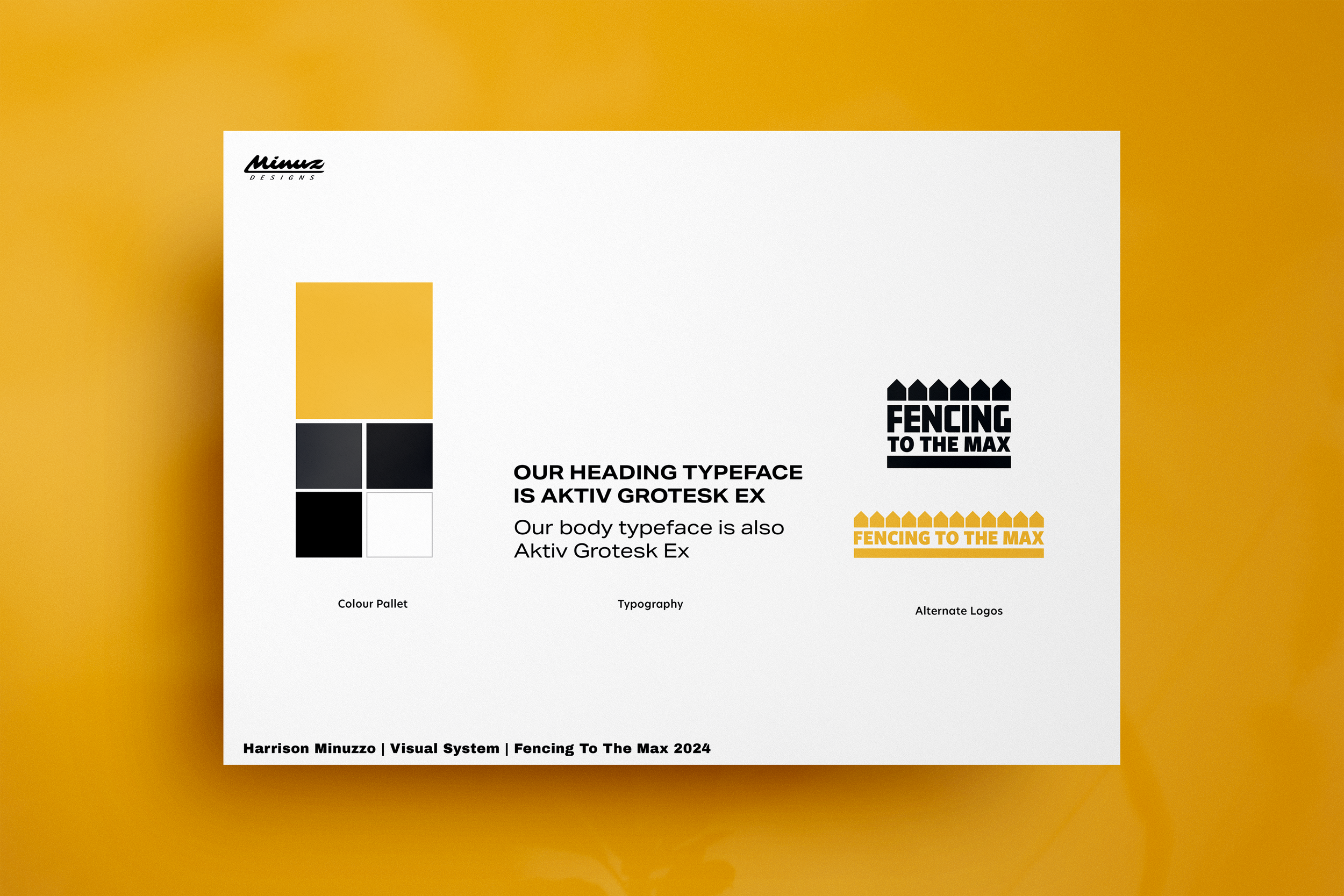
The logo needed to work in both 2 & 1 colour options, exist both horizontal & stacked, instantly communicate fencing & work across digital environments specifically insta & the website. Incorporating the client’s favourite colours, black & white the visual identity integrates secondary colours of grey & a contrasting yellow tone to bring a sense of optimism & fun. It uses the authoritative Aktiv font that is both bold & with quirky personality, reflective of the creative side of the business owner.
Digital
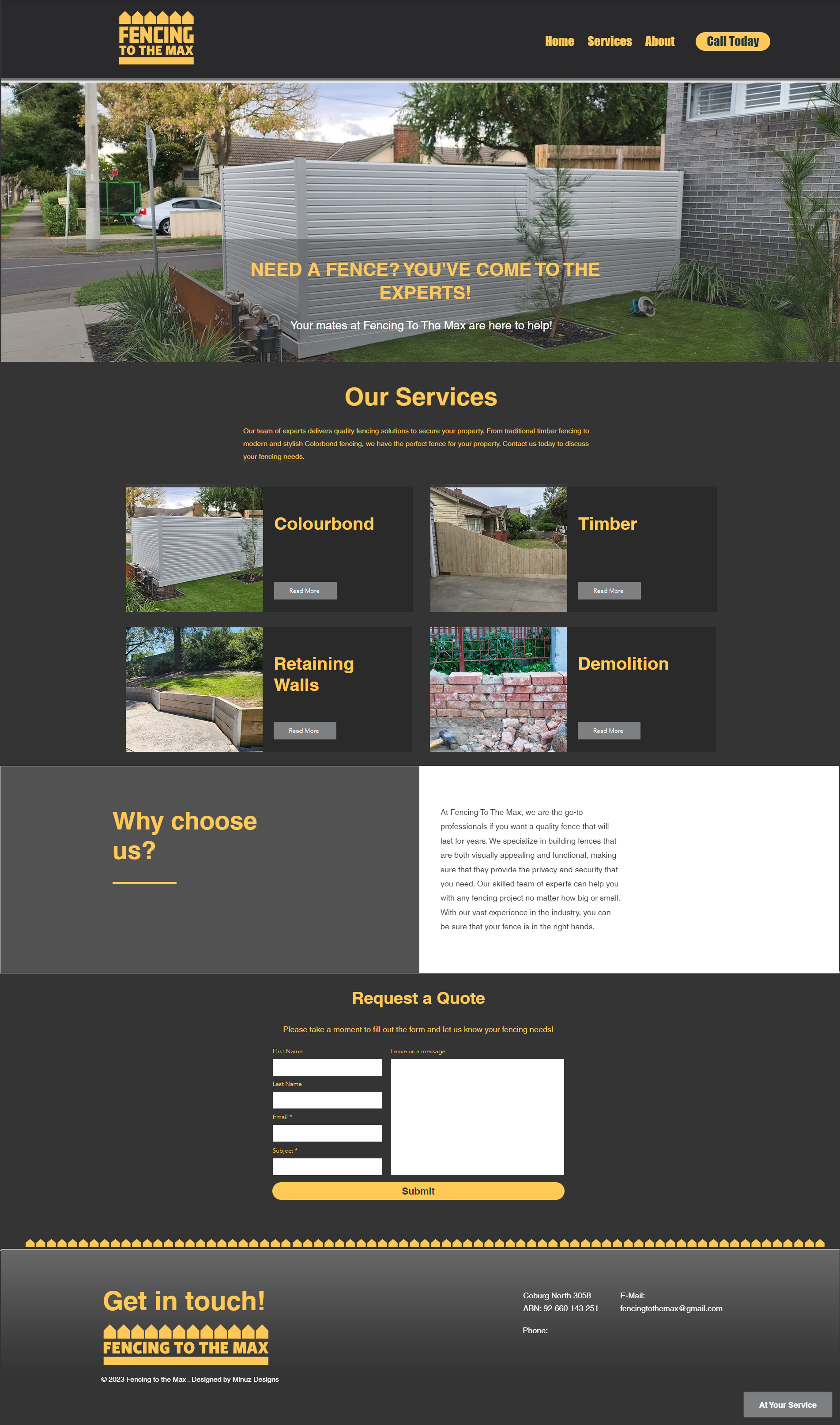
By incorporating the fence graphic onto the business card and then using the same visual on posters for advertising, I established a cohesive brand identity. This strategy not only reinforces brand recognition but also creates a connection between their online and offline promotional materials. The minimalistic design of the business card conveys professionalism and simplicity, traits that can appeal to potential clients.
I also designed a poster to be put up on the actual fences the business builds as a strategic move to captivate the attention of passersby and effectively target a specific audience depending on where the fences are located. Overall, combining the use of elements like the fence graphic across different mediums enhances the impact of the design and marketing efforts.